


Simplifying Pizza App Navigation for Seniors
This mobile app project addresses the topic of accessibility all while demonstrating how to enhance the user experience for elderly pizza lovers.
Overview
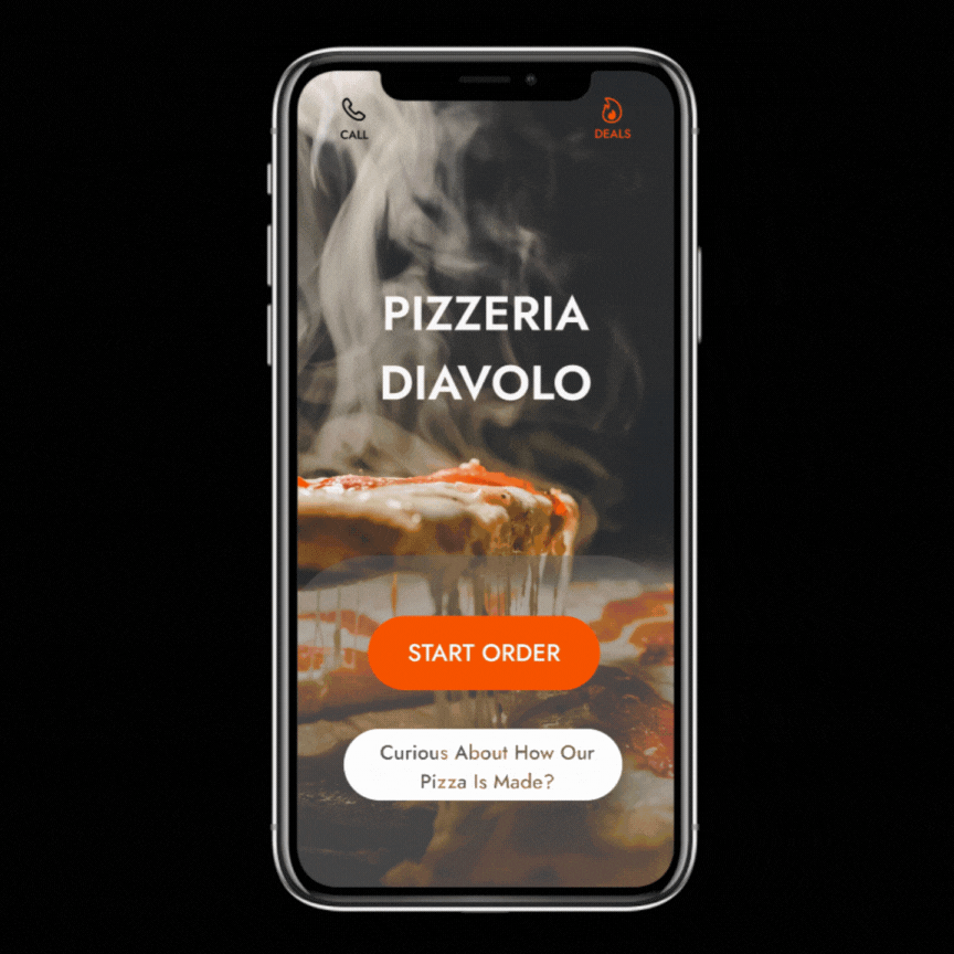
Pizzeria Diavolo is a unique pizzeria based in Saint-Leonard, aiming to serve the aging population of the borough. The company sought to expand its reach by creating a pizza application that enables its elderly customers to order customized pizzas quickly and efficiently.
TL;DR - 5 min ⏱️ Summary
Roles & Responsibilies
Maria Rizzuto led the UX research and design process, including remote user interviews, user tests, competitive analysis, empathy mapping, and prototyping.
Scope & Constraints
The project had a timeline of 5 weeks and focused on a user group often overlooked in design studies. Due to it being a small business, it also had a resource constraint which led to a UX team of one.
Users & Audience
The average consumer of Pizzeria Diavolo’s products, and thus the target demographic for this app, is between the ages 55 and 79, Italian, and purchases the same order consistently.
The primary user persona, "Aging Agatha," represents this senior demographic with specific needs, frustrations, and mindsets related to technology usage and pizza ordering. We will introduce her to you at the beginning of the user research section of this case study.
The Problem
The challenge was to develop an application that fosters trust and efficiency for older users, who typically prefer traditional pizza ordering methods over digital platforms. The core design hurdle was to establish trust, transparency, and warmth during the pizza ordering process.
Finding The Right Solution
To foster innovation and problem-solving through a user-centred approach, the starting point for finding a solution for Pizzeria Diavolo and its target users was the design thinking framework.

To accommodate the time and resource constraints of this project, the 5 Design Thinking steps were condensed to the following 4 steps that made up the application's User Experience Research and Design:
Step 1:
Understanding The User
-
User Interviews
-
Persona
-
User Journey Map
User Interviews
To address the objective of understanding user preferences and pain points in online pizza ordering, we (by we I always mean me, myself, and I - we do everything together 😉) performed 3 interviews with our target user group that yielded several key insights:
👍🏻 On the positive side, gains identified during the interviews included:
1. Discounts: users value discounts offered by online pizza ordering platforms.
2. Ease of use: users appreciate platforms that are easy to navigate and use.
3. Customer Service: the option to call in and pick up an order is highly appreciated by users.
👎🏻 Negative experiences voiced by users:
1. Overwhelmed by too many options: users tend to choose the same 1 or 2 flavours repeatedly.
2. Difficulty of use: Non-tech-savvy users find the platform challenging to navigate.
3. Effort-consuming process: users express frustration with the lengthy ordering process.
4. Distrust: users experience difficulty trusting new apps with their banking information.
User Pain Points
Exhausted at the end of a long day
Missing good-old quality customer service
Doesn't trust new apps with banking information
Using a new app can feel like work
Persona: Agatha
Based on the collected research, we built our primary persona. A unifying experience shared by interviewees that characterizes our persona is that they are looking to alleviate themselves of responsibility at the end of a stressful day. Turning to pizza as a way to make all of their loved one’s happy.

This primary user persona, "Aging Agatha," represents our targeted senior demographic with specific needs, frustrations, and mindsets related to technology usage and pizza ordering, informing the foundation of the research.
User Journey Map

⬇️

Breaking down our persona's actions and connecting them to feelings in our journey map helped us further empathize with our persona, simultaneously kickstarting the brainstorming process with the help of the 'improvement opportunities' section.
Bringing us to our define and ideate phase.
Step 2:
Define & Ideate
-
How Might We Question
-
Competitive Analysis
-
User Flows

How might we establish trust, transparency, and warmth during the entire pizza ordering process?
Competitive Analysis
An Example of Trust...

This welcome page is a great example of the law of reciprocity and establishing trust and good will through offering deals upfront.

Transparency...

This cart page demonstrates transparency in the way it allows for user control and freedom. The user is provided a level of oversight and detail as well as multiple ways to edit the order.

and Warmth.

This welcome page taps into the customer service that users said they missed during the interview process. The welcome text providing a sense of human warmth.

"Mirror... and do it better."
Priscilla Elizabeth Mastrangelo,
Senior UX & Web Designer
By keeping our core design goal to establish trust, transparency, and warmth during the pizza ordering process in mind, we performed a competitive analysis of 3 of Pizzeria Diavolo's competitors' applications.
The in-depth competitor analysis allowed us to see what was being done well and what were some opportunities for our app to improve the user experience by mirroring just the right parts that aligned with our audience and goal.
Initial Sketches
An Example of Trust...
This welcome page is a great example of the law of reciprocity and establishing trust and good will through offering deals upfront.

Transparency...
This review-order page demonstrates transparency in the way it allows for user control and freedom. The user is provided a level of oversight and detail as well as multiple ways to edit the order.

and Warmth.
This welcome page taps into the customer service that users said they missed during the interview process. The welcome text providing a sense of human warmth.

You are not seeing double...
What you are witnessing is mirroring, but better 😉.
Not better in the sense that it is more visually pleasing (that comes in the next section). But better in the sense that our client receives a tailored version of industry best practices that are informed and customized based on the user research performed earlier in the process.
For example, these two frames ➡️
were inspired by our user journey map, namely:
-
An opportunity to ensure there are images and a clear path throughout the app to facilitate the purchasing process.
-
Tracking delivery so that the time doesn’t feel like it’s passing too slowly.


Step 3:
Prototype & Design
-
Paper Wireframes
-
Low-Fi Usability Test
-
Prototype
Low-Fi Usability Test

Accommodation Example
When it came to doing usability tests with the paper wireframes, they were kind of a thumbs-down at the beginning because it was hard for the users to contextualize what the different elements meant.
As a way to close the gap between the user and the low-fidelity prototype, we walked through some of the competitors that we use for our competitor analysis with the user first, which as a whole wielded some great feedback as we were able to fact-check some assumptions that were made based our persona.
As a result of this testing, some of the paper mock-ups had to be tweaked.

For example, the interviews challenged the idea that more pages are more work.
⬅️ More pages here, like a billing information confirmation page, were seen as a huge benefit and comfort.
The findings of these tests also challenged the assumption that just because the user liked one feature in one section of the app does not mean it’s a universal win.
The same check boxes that were a hit in one place can create confusion in others which enforces the importance of user tests. ➡️


Overall, it was great to see areas for improvement, especially early on, before more time was invested in more high-fidelity mockups.
⬅️ One last example is this 'order stalling' page, which created unexpected confusion with the user who tended to undo the order - so we removed that page altogether.
Prototype


Equipped with our user search and initial tested sketches, we had a blueprint of what the prototype of the app would look like.
Here we can see some direct transformations that occurred as a result of user feedback received in the section above:

⬇️


⬇️


⬇️

Step 4:
Test & Refine
-
Usability Test
-
Accessibility
-
Findings
Usability Test
Now was the time to test the prototype, which went by much smoother than testing the paper wireframes as the user was more accustomed to what they were looking at.
More feedback was garnered to further enhance the design's experience:
An Example of Trust...
Users appreciated the added reassurance of:
-
the security credential at the top of the screen
-
the added benefit of a tip calculator
-
and the option to use a gift card should they not desire to add their personal billing information.

Transparency...
Similarly to the 'review-order' page, this 'menu item' page provides the user a level detail that accommodates various needs.
A change that was made as a result of the latest usability test was to provide a 'special instructions' box to allow even more control on their order.

and Warmth.
An assumption that was dispelled through the testing process was that users don't like pop-ups because of the bombardment of pop-ups online that generally break trust.
Funny enough, asking if you forgot anything brings an element of customer service and value according to the users.

Accessibility
Overlapping Needs: People who are Elderly and People with Disabilities
Initial Assumptions
Initial assumptions about this mature user segment is that they would be difficult to study and that they would not be interested in apps at all, which could not be further from the truth.
All three interviewees had favourite apps that they use daily. A report by AARP found that 86% and 62% of the age group between 50–59 and 70+ use a smartphone in America, which indicates their positive adaptability to technology.
Secondary Research
In our secondary data, we see that this is unfortunately a vulnerable population when it comes to putting valuable information online - which only further substantiates the user pain point discovered during the interview process.
It's an important segment to study nonetheless because they have growing numbers and access to smartphones. Accommodations simply have to be made with the pain point in mind (like offering the option to input gift card credentials instead of credit card information).
Opportinities
The research also found that there is an interesting overlap between the needs of the elderly and people with disabilities.
Many older people have age-related impairments that can affect how they use the web, such as declining:
-
vision — including reduced contrast sensitivity, color perception, and near-focus, making it difficult to read web pages
-
physical ability — including reduced dexterity and fine motor control, making it difficult to use a mouse and click small targets
-
cognitive ability — including reduced short-term memory, difficulty concentrating, and being easily distracted, making it difficult to follow navigation and complete online tasks
These issues overlap with the accessibility needs of people with disabilities. Thus, websites, applications, and tools that are accessible to people with disabilities are more accessible to older users as well.
Basically: when you're designing for the elderly, and you are inadvertently also designing for a greater breadth of accessibility which results in a larger group of people finding ease in using your app.
Going Forward
Summary: Through this project, Pizzeria Diavolo not only enhanced its digital presence but also demonstrated a commitment to inclusivity and user-centered design.
Impact
The project successfully met its goal of creating a prototype that prioritized the needs of elderly users.
Insights from user tests emphasized the importance of thoughtful design decisions and continuous iteration. Lessons learned included the necessity of more extensive user testing with older demographics and closer attention to design details like color contrast and font sizing.
Through this project, Pizzeria Diavolo not only enhanced its digital presence but also demonstrated a commitment to inclusivity and user-centered design.
By catering to the needs of Aging Agatha and similar users, the pizza app embodies a harmonious blend of accessibility, functionality, and warmth, ensuring that ordering a pizza becomes a delightful experience for seniors and tech-savvy individuals alike.
Designs


