


Designing for the
next billion students
This mobile-first redesign project addresses the topic of accessibility by offering offline educational resources and digital classrooms to remote areas via a tiny box.
Project at a glance
Problem:
Remote school teachers need digital tools that are accessible for students with varying reading abilities and limited internet access.
Solution:
We redesigned UNI, a mobile application, focusing on simplicity, accessibility, and clear instructions, with an intuitive interface that supports teachers in customizing learning materials for their students.
Impact Measured:
-
83% increase in the survey recipient’s willingness to trust UNI on their own device
-
40% increase in their trust score of the app as a whole (from 2.5 / 5 to 4.5 / 5 average)

Before

After
The product
Project duration
Feb 2024 to Apr 2024
Primary ask
Simplify UNI’s design so that it would foster trust and confidence in its non-technical users.
Why this project matters
Almost half the world’s population, 3.7 billion people live offline.
Remote learning remains out of reach for at least 500 million students around the world.
-
📊 Trends: There is a growing dependence on digital tools and a lack of connectivity in some regions - the deployment of infrastructure is not proportional to demand.
-
⚡Needs: Computers and networks should just work whenever they’re needed, regardless of what device is used or where it's used.
-
🚩 Problems: Current solutions are too expensive or complicated.
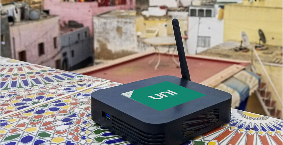
Grey-box was created to address this specific social and technical issue. Their product, UNI, offers offline educational resources and digital classrooms in a tiny box.

Understanding the user
when you don't have access to them
Problem:
We did not have direct access to existing UNI users because they lived in remote areas where international communication is difficult.
Solution:
We pivoted our research approach and relied heavily on existing client resources and secondary research to build a key persona, journey map and problem statement.

What Google's Next Billion Users (NBU) have in common with UNI Users
-
Limited Internet Access: Users often have restricted internet connectivity, requiring offline functionality and efficient data usage.
-
Literacy Challenges: Some users possess limited literary skills, necessitating a design that relies heavily on visual cues and simple language.
-
Remote Locations: Many users reside in rural or underdeveloped areas, making accessibility a primary concern.
NBU: Accessibility considerations
Provide clear instructions on how to use your product or service for users.
Use visual cues like images and icons.
NBU-inspired Persona helps us find UNI end-user proxy
To empathize with our users and tailor our design to their needs, we created a persona named Adriana. Adriana is a remote school teacher who requires digital tools to house and share educational resources.
Her students range in age and reading ability, and she cannot rely on consistent internet access. Adriana's challenges and needs guided our design decisions, ensuring that the final product would be practical and user-friendly.


Problem Statement
Adriana is a remote school teacher who needs a digital tool to house her most valuable resources in a way that her students of all ages and reading abilities could easily use, because she cannot rely on existing internet access.
Creating a Baseline (out of thin air)
Problem:
Because UNI lives on a hardware device that allows for consistent offline access to its digital resources, we did not have access to the app itself since it wasn't possible to possess UNI hardware during the project's timeline.
Solution:
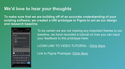
To create a baseline from which we could measure the impact of our recommendations, we created a UNI experience that was composed of stitched-together frames from a demo video.

Here is a walkthrough of the baseline prototype of the existing interface after having stitched together all the individual frames from the demo video into Figma:
Trust will be a big barrier to adoption
We conducted usability tests and a user survey with 10 proxy users that fit our established persona's profile (which included teachers and administrative staff) to gather firsthand insights into the baseline's designs.
Initial Findings
Our research highlighted several areas for improvement, including:
-
Surveys indicated a lack of trust in the initial design and a need for a more human touch.
-
The majority of recipients scored UNI 3 or less on 5 in terms of trustworthiness.
-
Users also highlighted the importance of simple, clear instructions.

Building trust by listening to users
and removing confusion
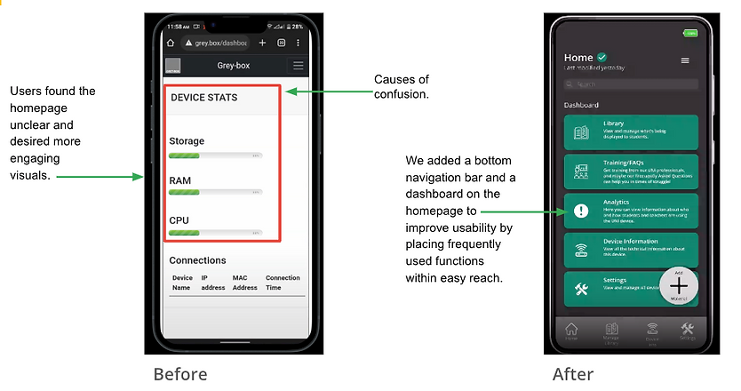
Priority #1 Homepage Clarity:
Users found the homepage unclear and desired more engaging visuals.
Priority #2 File Organization:
The file manager did not meet user expectations for organization, making it difficult for teachers to manage educational materials effectively.

Getting closer to achieving perfect trust
with every usability test
Priority #1 Homepage Clarity:
To ensure our design was accessible to all users, we made several enhancements:
-
Icons and General Terms: We used icons to reduce linguistic confusion and avoided technical jargon, making the app more accessible to users with varying literacy levels.
-
Layout Optimization: We designed our HiFi prototype on a less common, smaller Android resolution. This approach ensured our design would work well on devices commonly used in remote areas.

Priority #2 File Organization
One of the most critical features for our users was the ability to manage educational materials effectively. We made several enhancements to the library and file management system:
-
File Organization: We simplified the file management process, allowing users to create folders and upload files easily. This organization helps teachers like Adriana keep their materials well-organized and accessible.
-
Customization: We enabled teachers to customize home screens and content for their students, ensuring that each student sees relevant and personalized educational materials.

Feedback from our final round of testing
confirmed the success of our design
Our design successfully addressed the needs of remote school teachers by creating an accessible, easy-to-use tool that enhances the learning experience for students.
By focusing on simplicity, clear instructions, and customization, we achieved significant improvements in user trust, adoption, and satisfaction.
This project exemplifies our commitment to designing for the next billion students and contributing to the future of education technology.
Future Directions:
Looking ahead, we plan to continue refining and expanding our design to meet the evolving needs of our users:
-
Enhanced Offline Functionality: We will further develop offline features to ensure that users can access and manage educational materials without internet connectivity.
-
Additional Customization Options: We will explore new ways for teachers to customize the app, allowing for even greater personalization and flexibility.
-
Expanded User Research: We will conduct ongoing user research to gather feedback and insights, ensuring that our design continues to meet the needs of our users.
-
By staying attuned to the needs of our users and continually refining our design, we aim to create a tool that supports the education of the next billion students, helping teachers like Adriana provide the best possible learning experience for their students.
Lesson learned:
Managing multiple stakeholders
in a remote-first environment
Problem:
Conflicting stakeholder schedules made meeting to touch base difficult.
Solution:
The close rapport you build up with the core project team is absolutely fundamental to this, but it’s critical to never underestimate the importance of keeping the wider stakeholder group informed and on board.
This can simply be circulated to stakeholders as a more approachable and shareable version of a status update.